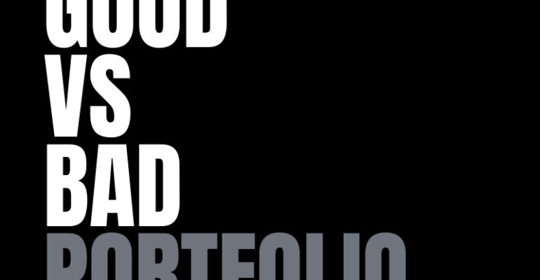
Good VS Bad Portfolio Websites | Do’s and Don’ts
Good VS Bad Portfolio Websites | Do’s and Don’ts
Today, I’m going to show you 2 portfolios, one of them is incredible and the other one, I don’t think it’s doing a great job for the designer who owns it.
Let’s get started diving into the website, now I want to say before starting that we do not intend our observations as a judgement on the website development company or disrespect to the designers’ hard work. I understand how much work goes into building a portfolio and respect that effort.
The only reason I’m giving this feedback is with the hope that it will help the owner to improve their work and so all-in good faith and I do respect everybody for so I do want to get started with the portfolio which I think is not doing great work for its owner.
Bad Portfolio: Tory Mond
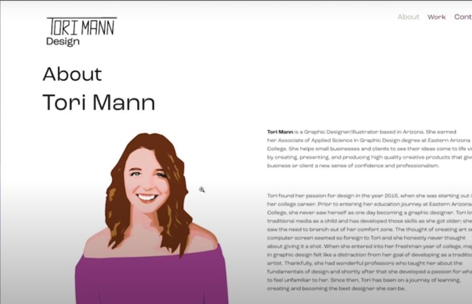
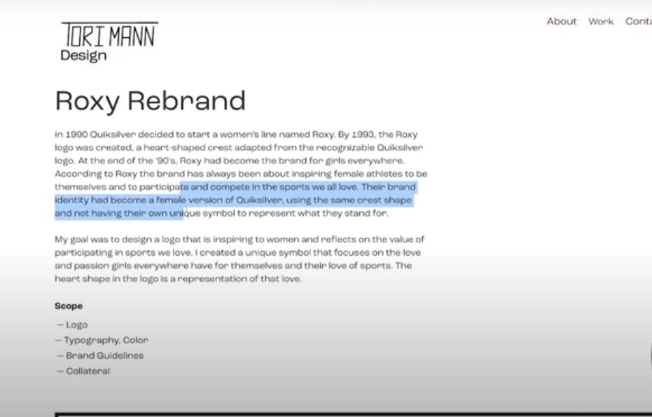
Let’s dive in, this is the website of tory mond and now I’m looking at this and I’m trying to know based on hierarchies where do I look first.
Well, there’s a big illustration of a girl so obviously I look at her but then I try to look at two other big elements, one is about toriman and the second is the logo they’re almost the same size and so basically there are two elements which are both of them are telling me the same thing.
I’m on the website of toriman she’s a designer and this is about her a lot of text as you know people do not love to read. So we scheme on the internet we’re looking for very short headlines to let us know that this is even worth reading.
Now, in this case, there’s a bunch of texts here so I’m not sure I’m going to dive into reading this and there’s no call to action. So I don’t know unless I want to dive into reading long text. Do I want to start reading right now and there’s no button here.
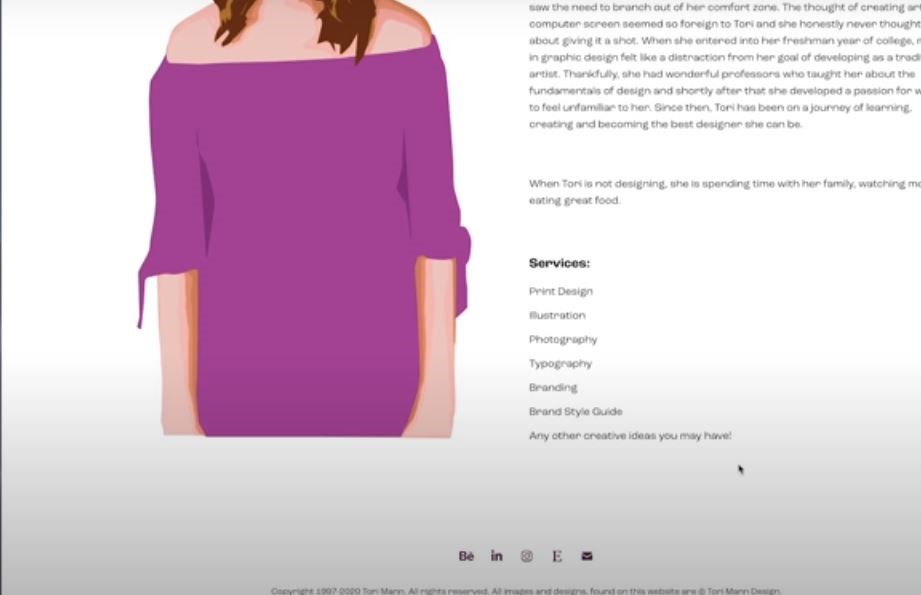
If we scroll down and you will see here services that are broken down in a scheme way, so I do know that she’s doing print design, illustration, photography, etc. I understand all of these things but I cannot see any work here and there’s no real call to action in terms of contact her or anything like this.
There are some links here to other platforms but that’s not what I’m looking for. I’m looking to see the work of tori and I can’t see it so I have to go to the top into works but I think that in terms of a landing page or in terms of I’m coming here, I don’t think this is doing good work because I still don’t know who is she working with how is she different.
A little bit about her without having to read all of that about long text stuff and so in a little glimpse into her work.
When a visitor to your website would always rather scroll down to explore what’s in this website VS clicking on something because clicking is taking a commitment while scrolling.
Just let me scroll down and see what else is here but right now I’ve exhausted my scrolling opportunities and I’m going to have to go here and click on the work now.
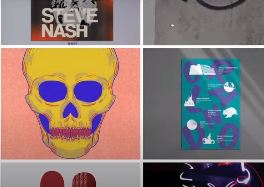
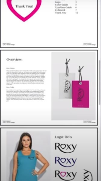
The work doesn’t look bad, it’s like solid design and if you click into them and now you get into the kind of a Rebrand.
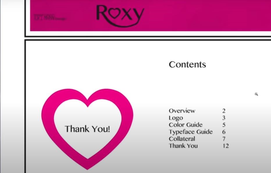
So a project looks like it was adapted from some kind of a print manual and it was just basically adapted into images while the work is not necessarily bad.
I do think that when you’re using images like this and you will see how this looks like on mobile.
Let’s assume this was a mobile thing then this wouldn’t be readable and so this is not well adjusted for mobile and that’s a problem when you’re just taking stuff that was meant for bigger screens.
So as a first experience just make sure that you have some clear, very short, titles, call to action, and a little bit some kind of visuals in terms of what you do now.
I want to contrast that with a website that made me smile and I think is doing fantastic work for its owners.
Good Portfolio: Papestielliz
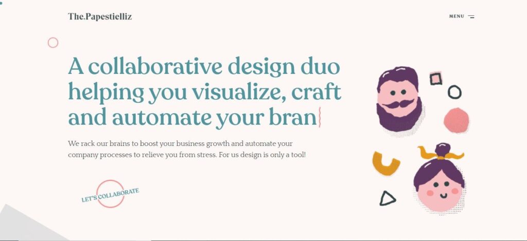
This is the website of Papestielliz. This is nice, there’s a very short headline that tells you very clearly the value proposition of what you’re going to get here and who are they, and what they can do for you.
You can even see kind of an animated cute illustration of them so there’s a lot of vibes and feeling into this and a call to action that also really moves and it’s kind of a playful call to action, Let’s collaborate.
If you scroll down then you will get some kind of visual example of what they can do. So you will see web design and development and if you click here you can dive in and it is good. You have to scroll if you want to explore more.
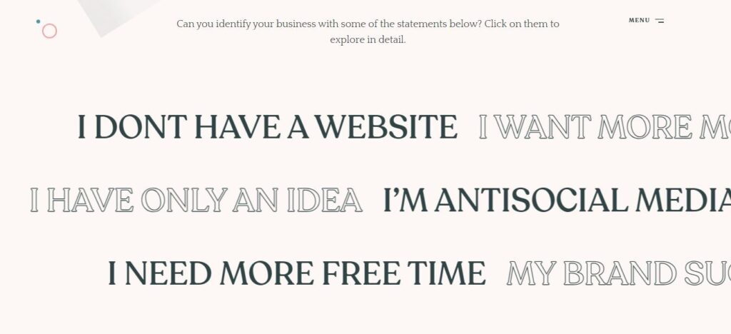
When you keep scrolling you will this section as shown in the above image and this made me smile. So if you don’t have a website or you want more money or you are anti-social media, So if you click on one of them then they’re giving you a personalized value proposition.
Then they’re telling you how they can help you and that’s a clever, playful way to say here are all the problems that you know we have and for different clients who have different goals or needs, and here’s how we can help you.
It is a playful, well-designed, and clever idea of personalizing the experience of their portfolio.
Keeping on scrolling you can see they’re sharing their process, what they’re doing, and then ends with a call to action.
If you dive more into the works you will how they present work and they’re giving you kind of an overview of what they did and you can dive deeper into each of these case studies. There are some nice visuals, text aligned with nice visuals and it is mobile responsiveness including a testimonial which is always great to show.

Let’s see there about the studio page, It cools how they are doing this, what they are doing best, and here’s a little bit of information about themselves.
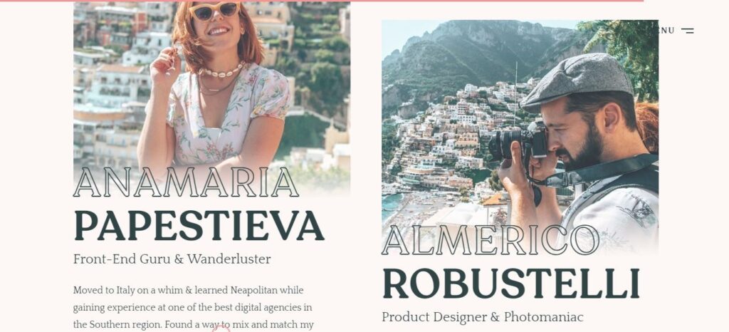
I loved at the end they showed real photos even though everything is illustrated because clients like to see the people that they end up working with. So I do think even though both websites were using illustration but they also ended up showing how they look like because this helps to build trust and relationships with the people that might end up working with you.
The points I have mentioned above are useful whether you are building your portfolio, or if you want to hire dedicated developers, to assess their understanding of design and development. Let me know in the description what you like best about this website or how it can be improved.